Roan: A Display Font That Elevates Digital Branding
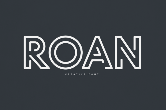
It started with a hero section—just me, a client’s new coaching website, and a blank headline field. I’d already chosen a clean, highly legible sans serif for body copy and navigation, but the “Welcome” line needed something more: warmth, intention, and quiet confidence. That’s when I dropped Roan into the mockup. Instantly, the space felt intentional—not just designed, but curated. Roan isn’t loud or flashy; it’s elegant, slightly architectural, with graceful curves and balanced proportions that read as both modern and timeless. As a display font, it doesn’t try to do everything—and that’s exactly why it works so well in real web layouts.
How Roan Performs Where It Matters Most
I tested Roan across several high-impact digital touchpoints: the hero banner, a testimonial highlight, a course enrollment CTA, and a subtle logo lockup in the header. On desktop, its letterforms hold clarity even at 48px with generous spacing—no crowding, no visual noise. On mobile? I scaled it to 32px with slightly increased letter-spacing (0.5px), and it retained its poise. The key was respecting its role: Roan shines brightest where attention is meant to land—not as functional UI text, but as expressive typography that signals brand voice before a single word is read.
One standout moment came when overlaying Roan on a softly blurred lifestyle image. Its medium contrast and open counters kept it legible without needing heavy text shadows or solid background bars. Other display fonts I’ve tried either disappeared into busy imagery or demanded too much visual compensation. Roan simply belongs—like a well-placed accent light in an interior.
Where Roan Fits (and Where It Doesn’t)
Roan is purpose-built for display use: headlines, section titles, callouts, logo variants, and branded graphic elements like quote cards or social media banners. It excels in contexts where typography carries emotional weight—think a boutique online store’s “New Arrivals” banner, a wellness brand’s “Begin Here” CTA, or a portfolio site’s project title treatment.
But—and this matters—it’s not meant for long-form reading, navigation labels, form fields, or small interface text. I tested it at 14px for a secondary button label, and while charming in concept, it lost legibility quickly on low-resolution screens and under fast-glance conditions. Likewise, avoid using Roan for dense product descriptions, FAQ answers, or any text requiring rapid scanning or accessibility-first compliance. For those, lean on your trusted sans serif companion—something like Inter, Poppins, or even system fonts for maximum performance and inclusivity.
Smart Pairing for Balanced Digital Typography
What makes Roan truly versatile in web design isn’t just how it looks alone—it’s how gracefully it pairs. I consistently paired it with a neutral, humanist sans serif (Inter Regular, 400 weight) for all body copy, captions, and supporting text. The contrast is subtle but effective: Roan brings character; Inter brings clarity. No tension, no competition—just thoughtful hierarchy.
For a more editorial or luxury-leaning site, I also explored pairing Roan with a refined serif (like Lora or EB Garamond) for pull quotes or blog post titles—though I reserved that for larger viewports only, since serifs can soften on smaller screens. The takeaway? Roan doesn’t demand attention-grabbing contrast. It thrives alongside typefaces that respect its elegance without mimicking it.
Practical Considerations Before You Implement
Before dropping Roan into a live site or client project, I double-checked three things: file formats, weights, and licensing. The version I used included WOFF2 files—ideal for fast loading—and offered Regular and Bold weights, which covered 95% of my heading needs. No italic variant, but that wasn’t a gap for my use case (and honestly, Roan’s structure doesn’t call for one). I also confirmed multilingual support covered Latin-based languages—including accented characters common in European markets—so it safely handled names, locations, and translated snippets.
Licensing was straightforward: the commercial license permits use on live websites, SaaS platforms, client sites, and digital templates—as long as end users aren’t redistributing the font files themselves. That gave me full confidence deploying it across landing pages, email headers, and branded PDFs like course workbooks or brand guidelines.
Real-World Readability Across Devices & Contexts
On dark mode interfaces, Roan held up beautifully—especially when set against deep charcoal or navy backgrounds. Its stroke consistency prevents visual vibration, and its x-height ensures comfortable reading at recommended sizes. Over light backgrounds, it remained crisp without appearing stark or thin. I did avoid placing it directly over complex SVG patterns or gradient overlays unless I added a subtle semi-transparent background behind the text block—just enough to anchor it without dulling its presence.
For buttons and interactive elements, I used Roan only on primary CTAs with ample padding and hover states that preserved its integrity (no scaling down on tap, no abrupt weight shifts). And crucially—I always tested with actual users during soft launches. One designer friend noted how “calmly confident” the typography felt, while a non-designer client said it made her service feel “thoughtfully crafted, not just assembled.” That’s the quiet power of a well-chosen display font.
If you’re choosing typography to express care, clarity, and quiet distinction—Roan earns its place. It won’t solve weak content or poor UX, but in the right context, it adds a layer of intentionality that resonates. Not as decoration, but as voice. As identity. As the first impression that invites people to stay a little longer.